Today I learned that my previous attempt at theming a Material UI component was not right. I thought the default theme overrides I was providing were also being used in the component style overrides. But they were not.
After debugging the theme object in Chrome, I could see that before useStyles() was called, my theme object was as expected, with my colour set. But the when I stepped into the useStyles() function and observed the theme object it was using, the colour was not right. I had assumed that the styles argument that makeStyles took was my global theme object. The AppBar background was yellow, so the theme was working in general, just not for my component style overrides.
I put a CodeSandbox together to illustrate the differences:
WronglyThemed.js
import React from "react";
import { makeStyles } from "@material-ui/core/styles";
import { createMuiTheme } from "@material-ui/core/styles";
import { ThemeProvider } from "@material-ui/styles";

import AppBar from "@material-ui/core/AppBar";
import Toolbar from "@material-ui/core/Toolbar";
import Typography from "@material-ui/core/Typography";
import Button from "@material-ui/core/Button";
import IconButton from "@material-ui/core/IconButton";
import MenuIcon from "@material-ui/icons/Menu";

const newTheme = createMuiTheme({
  palette: {
    primary: {
      main: "#ffcc00"
    }
  }
});

const newStyles = {
  root: {
    flexGrow: 1,
    borderTop: `3px solid ${newTheme.palette.primary.dark}`
  },
  menuButton: {
    marginRight: newTheme.spacing(2)
  },
  title: {
    flexGrow: 1
  }
};

const useStyles = makeStyles(newStyles);

function Custom() {
  const classes = useStyles();

  return (
    <ThemeProvider theme={newTheme}>
      <div className={classes.root}>
        <AppBar position="static">
          <Toolbar>
            <IconButton
              edge="start"
              className={classes.menuButton}
              color="inherit"
              aria-label="Menu"
            >
              <MenuIcon />
            </IconButton>
            <Typography variant="h6" className={classes.title}>
              News
            </Typography>
            <Button color="inherit">Login</Button>
          </Toolbar>
        </AppBar>
      </div>
    </ThemeProvider>
  );
}

export default Custom;
The above will render out a yellow AppBar with a dark blue border on top. Not what I wanted!
CorrectlyThemed.js
import React from "react";
import { makeStyles } from "@material-ui/core/styles";
import { createMuiTheme } from "@material-ui/core/styles";
import { ThemeProvider } from "@material-ui/styles";

import AppBar from "@material-ui/core/AppBar";
import Toolbar from "@material-ui/core/Toolbar";
import Typography from "@material-ui/core/Typography";
import Button from "@material-ui/core/Button";
import IconButton from "@material-ui/core/IconButton";
import MenuIcon from "@material-ui/icons/Menu";

const newTheme = createMuiTheme({
  palette: {
    primary: {
      main: "#ffcc00"
    }
  }
});

const newStyles = {
  root: {
    flexGrow: 1,
    borderTop: `3px solid ${newTheme.palette.primary.dark}`
  },
  menuButton: {
    marginRight: newTheme.spacing(2)
  },
  title: {
    flexGrow: 1
  }
};

const useStyles = makeStyles(newStyles);

function Custom() {
  const classes = useStyles();

  return (
    <ThemeProvider theme={newTheme}>
      <div className={classes.root}>
        <AppBar position="static">
          <Toolbar>
            <IconButton
              edge="start"
              className={classes.menuButton}
              color="inherit"
              aria-label="Menu"
            >
              <MenuIcon />
            </IconButton>
            <Typography variant="h6" className={classes.title}>
              News
            </Typography>
            <Button color="inherit">Login</Button>
          </Toolbar>
        </AppBar>
      </div>
    </ThemeProvider>
  );
}

export default Custom;
The above code will render a yellow AppBar with a dark yellow border on top. Yay! I figured that passing a newStyles styles object into makeStyles() that already used my newTheme theme object would prevent it overriding my settings.
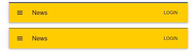
Both components, right and wrong(ly) themed
Conclusion
Although this is all good to learn, and figuring out what is wrong and fixing it is ultimately a good lesson, I think some of this could have been made more obvious from the beginning if I had used better names for my variables and parameters. For example, if I had written this:
// ObviouslyWrongThemedComponent.js
const newTheme = createMuiTheme({
  palette: {
    primary: {
      main: "#ffcc00"
    }
  }
});

// `theme` argument is obviously not using `newTheme`
const useStyles = makeStyles(theme => ({
  root: {
    flexGrow: 1,
    borderTop: `3px solid ${theme.palette.primary.dark}`
  },
  menuButton: {
    marginRight: theme.spacing(2)
  },
  title: {
    flexGrow: 1
  }
}));
Instead of this:
// WrongThemedComponent.js
const newTheme = createMuiTheme({
  palette: {
    primary: {
      main: "#ffcc00"
    }
  }
});

// Took me a while to see that `newTheme` argument and `newTheme` constant are unrelated
const useStyles = makeStyles(newTheme => ({
  root: {
    flexGrow: 1,
    borderTop: `3px solid ${newTheme.palette.primary.dark}`
  },
  menuButton: {
    marginRight: newTheme.spacing(2)
  },
  title: {
    flexGrow: 1
  }
}));
Then I would have seen there was no relationship between the makeStyles() argument and the newTheme constant.