Today I learned how to extend the Material UI default theme and retain the default theme settings for my own style overrides.
This takes a little explaining. The Theme in Material UI is responsible for the higher level styling. It contains settings for the colour palette, typography and other useful helper methods such as theme.spacing(). Style overrides I would define as fine level style changes of the Material UI components, for example changing the thickness of an underline on a input component.
It took me a while to understand how to achieve both of these goals. This is an example of the code (available on CodeSandbox) I came up with:
App.js
import React from "react";
import ExampleComponent from "./ExampleComponent";
import Container from "@material-ui/core/Container";

function App() {
  return (
    <Container maxWidth="md">
      <ExampleComponent />
    </Container>
  );
}

export default App;
App just acts like a container. Imports my ExampleComponent.
Theme.js
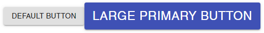
import { createMuiTheme } from "@material-ui/core/styles";
import blue from "@material-ui/core/colors/blue";

const Theme = createMuiTheme({
  palette: {
    primary: {
      light: blue[200],
      main: blue[500],
      dark: blue[500]
    }
  }
});

export default Theme;
Theme imports a Material UI colour (just used as an example, this could be manually set hex strings) and uses createMuiTheme to generate a theme.
ExampleComponent.js
import React from "react";
import { makeStyles } from "@material-ui/core/styles";
import { ThemeProvider } from "@material-ui/styles";
import Button from "@material-ui/core/Button";
import theme from "./Theme.js";
// 'Extend' the default styles
const useStyles = makeStyles(theme => ({
button: {
fontSize: theme.typography.pxToRem(24)
}
}));
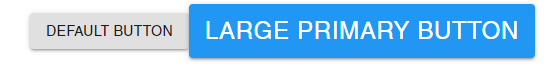
function ExampleComponent(props) {
const classes = useStyles();
return (
<ThemeProvider theme={theme}>
<Button variant="contained">
Default button
</Button>
<Button color="primary" variant="contained" className={classes.button}>
Large primary button
</Button>
</ThemeProvider>
);
}
export default ExampleComponent;
ExampleComponent imports the Theme, but also overrides the Material UI button’s font size using the default theme helper theme.typography.pxToRem().
Default button colour