Today I learned how to apply style overrides to Material UI (v4.0.0-beat.2), a React front-end component library.
The company I work for is looking to develop some new tools, which we want to get to a prototype stage as soon as possible. We have decided to use React as part of our tech stack (which is good), and knowing that the UI that these tools require is going to need a lot of UI components, I started to look at front-end component libraries (mainly Material UI and Ant Design).
I did a analysis of the types of UI components we need to build our tool - tooltips, various inputs, switch style buttons, modals, dialogs & drop downs. I wanted to make a test ‘App’ that would combine various components from the library. My main goal was to see how this library was going to be to work with.
After installing the relevant packages into a new create-react-app project, I began to import some components and read the docs. I also began to tweak anything that looked recognisable. At first things did not go well. I could not customise what I felt were basics, such as an inputs focused state.
After reading the docs (again) and looking at the examples, I got to this point using withStyles:
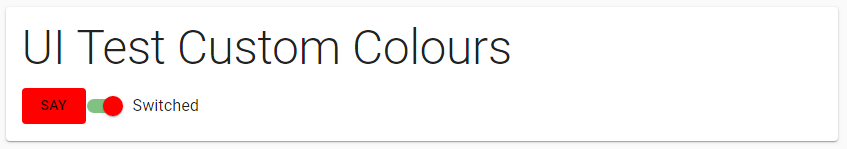
A beautiful mess
import React from 'react';
import { withStyles } from '@material-ui/core/styles';
import Typography from '@material-ui/core/Typography';
import Container from '@material-ui/core/Container';
import Paper from '@material-ui/core/Paper';
import Button from '@material-ui/core/Button';
import Tooltip from '@material-ui/core/Tooltip';
import FormControlLabel from '@material-ui/core/FormControlLabel';
import Switch from '@material-ui/core/Switch';

// Define a styles object
const MyButtonstyles = {
  root: {
    backgroundColor: 'red',
    '&:hover': {
      color: 'purple',
    },
  }
};
// Include the styles object
const MyButton = withStyles(MyButtonstyles)(Button);

// Testing custom colours per component

// More concise syntax version
const MyContainer = withStyles({
  root: {
    marginTop: '4rem',
  },
})(Container);

const MyPaper = withStyles({
  root: {
    padding: '1rem',
  },
})(Paper);

const Title = withStyles({
  root: {
    fontSize: '3rem',
  },
})(Typography);

const MyTooltip = withStyles({
  tooltip: {
    backgroundColor: 'white',
    color: 'rgba(0, 0, 0, 0.8)',
    boxShadow: '0px 0px 4px rgba(0, 0, 0, 0.3)',
    fontSize: '16px',
  },
})(Tooltip);

const MySwitch = withStyles({
  switchBase: {
    color: 'silver',
    '&$checked': {
      color: 'red',
    },
    '&$checked + $track': {
      backgroundColor: 'green',
    },
  },
  checked: {},
  track: {},
})(Switch);

function UITester() {
  const [state, setState] = React.useState({
    checkedA: true,
    checkedB: true,
  });

  const handleChange = name => event => {
    setState({ ...state, [name]: event.target.checked });
  };

  return (
    <MyContainer>
      <MyPaper>
        <Title variant="h2" gutterBottom>
          UI Test Custom Colours
        </Title>
        <MyTooltip title="Hello!">
          <MyButton>Say</MyButton>
        </MyTooltip>
        <FormControlLabel
          control={
            <MySwitch
              checked={state.checkedA}
              onChange={handleChange('checkedA')}
              value="checkedA"
            />
          }
          label="Switched"
        />
      </MyPaper>
    </MyContainer>
  );
}

export default UITester;
This achieved some little goals. I could modify pseudo classes, states and component children. So that gave me some confidence that I could control the style on the components if I needed to.
I had seen in the docs that the default theme had some nice utilities, such as pixel to rem functionality, that I wanted to take advantage of. The above code uses the withStyles Higher-order component API. I don’t fully understand what a Higher-order component API is to be honest. It seemed like I could use the makeStyles Hook API to access the default theme utilities.
Again I found it tricky at first to get the correct syntax to be able to style component child elements, such as the switch’s ‘track’. I looked at a lot of examples, re-read the docs (once more) and figured out this syntax pattern would override the default theme styling:
  switchBase: {
    '&$checked': {
      color: orange[500],
    },
    '&$checked + $track': {
      backgroundColor: orange[400],
    },
  },
  track: {},
  checked: {},
This allowed me to use the theme utilities such as theme.spacing() and also keep default theme styling where I wanted it. I gave the component a touch of orange:
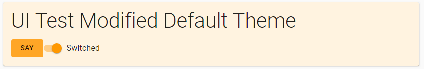
Tangerine dream
import React from 'react';
import { makeStyles } from '@material-ui/core/styles';
import Typography from '@material-ui/core/Typography';
import Container from '@material-ui/core/Container';
import Paper from '@material-ui/core/Paper';
import Button from '@material-ui/core/Button';
import Tooltip from '@material-ui/core/Tooltip';
import FormControlLabel from '@material-ui/core/FormControlLabel';
import Switch from '@material-ui/core/Switch';
import orange from '@material-ui/core/colors/orange';

// New styles that extend the default theme
const useStyles = makeStyles(theme => ({
  '@global': {
    body: {
      backgroundColor: theme.palette.grey[50],
    },
  },
  title: {
    fontSize: theme.typography.pxToRem(42),
  },
  paper: {
    backgroundColor: orange[50],
    marginTop: theme.spacing(8),
    padding: theme.spacing(2),
  },
  switchBase: {
    '&$checked': {
      color: orange[500],
    },
    '&$checked + $track': {
      backgroundColor: orange[400],
    },
  },
  track: {},
  checked: {},
  button: {
    backgroundColor: orange[400],
    '&:hover': {
      color: orange[800],
    },
  },
  tooltip: {
    backgroundColor: 'white',
    color: 'rgba(0, 0, 0, 0.8)',
    boxShadow: '0px 0px 4px rgba(0, 0, 0, 0.3)',
    fontSize: '16px',
  }
}));

function UITesterThemed() {
  const classes = useStyles();

  const [state, setState] = React.useState({
    checkedA: true,
    checkedB: true,
  });

  const handleChange = name => event => {
    setState({ ...state, [name]: event.target.checked });
  };

  return (
    <Container>
      <Paper className={classes.paper}>
        <Typography variant="h2" gutterBottom className={classes.title}>
          UI Test Modified Default Theme
        </Typography>
        <Tooltip title="Hello!" classes={{ tooltip: classes.tooltip }}>
          <Button className={classes.button}>Say</Button>
        </Tooltip>
        <FormControlLabel
          control={
            <Switch
              classes={{
                switchBase: classes.switchBase,
                track: classes.track,
                checked: classes.checked
              }}
              checked={state.checkedA}
              onChange={handleChange('checkedA')}
              value="checkedA"
            />
          }
          label="Switched"
        />
      </Paper>
    </Container>
  );
}

export default UITesterThemed;
CSS in JS is pretty much brand new to me and I am unsure if there is syntax here that is specific to Material UIs way of doing things. I am sure I will learn more about that soon.