Controlled inputs and performance

Today I learned about the performance impact of using controlled inputs in React.

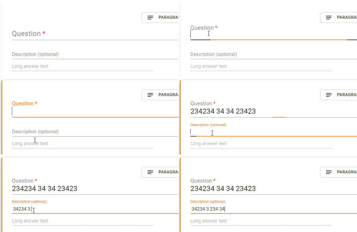
I noticed that once I had multiples of a component I’d made on screen (that included text inputs) the typing performance would begin to lag. It also got exponentially worse for each additional component.

onChange vs onBlur

The main difference I tried was changing my event from onChange to onBlur (this was based on some Stack Overflow advice).

Before

Animated gif showing poor input performance

Laggy input performance

Material UI theming and style overrides - Part 3

Today I learned more about sharing styles across React components. Although CSS-in-JS is new to me, it is pretty easy to pick up (Although I have not formed a final opinion on it yet…). I think Material UI uses React JSS under the hood, so a style can be written as an object:

import React from 'react';
import { makeStyles } from '@material-ui/styles';

const useStyles = makeStyles({
  root: {
    backgroundColor: 'red',
  },
});

export default function MyComponent() {
  const classes = useStyles();
  return <div className={classes.root} />;
}

Refactor to be more DRY

I had three components that were pretty similar to each other, with enough unique parts to keep them seperate. But they all had a style object in them. I could see the style object was about 90% duplicated between each component. So after using a diff tool to see what the differences were, I extracted the shared styles out into a new file called Styles.js. That looks a little like this:

Material UI theming and style overrides - Part 2

Today I learned that my previous attempt at theming a Material UI component was not right. I thought the default theme overrides I was providing were also being used in the component style overrides. But they were not.

After debugging the theme object in Chrome, I could see that before useStyles() was called, my theme object was as expected, with my colour set. But the when I stepped into the useStyles() function and observed the theme object it was using, the colour was not right. I had assumed that the styles argument that makeStyles took was my global theme object. The AppBar background was yellow, so the theme was working in general, just not for my component style overrides.

I put a CodeSandbox together to illustrate the differences:

Material UI theming and style overrides - Part 1

Today I learned how to extend the Material UI default theme and retain the default theme settings for my own style overrides.

This takes a little explaining. The Theme in Material UI is responsible for the higher level styling. It contains settings for the colour palette, typography and other useful helper methods such as theme.spacing(). Style overrides I would define as fine level style changes of the Material UI components, for example changing the thickness of an underline on a input component.

The basics of React Redux

Today I learned the basics of React Redux because the state requirements of the React app I have been building are now in need of a better solution.

I am a fairly experienced front-end developer, and I know how to use lots of technologies. But I was struggling with grasping the fundamentals of using React Redux. I have used Vuex previously, which I picked up pretty quickly and I thought it would be similar. They are similar in concept, but not in execution. I think Vue deserves a lot of credit for their documentation as it is really good.

What I was looking for was a basic tutorial, the most basic. But every “basic” tutorial was how to make a todo app. But I honestly needed a Hello world, just to see how the code was wired together. This is from the redux documentation:

Don’t be fooled by all the fancy talk about reducers, middleware, store enhancers—Redux is incredibly simple. If you’ve ever built a Flux application, you will feel right at home. If you’re new to Flux, it’s easy too!

Source

I would agree in hindsight that it is relatively easy, but the path to that knowledge is shrouded in fog. It was time to find alternative education!
Front-end test drive: Material UI

Today I learned how to apply style overrides to Material UI (v4.0.0-beat.2), a React front-end component library.

The company I work for is looking to develop some new tools, which we want to get to a prototype stage as soon as possible. We have decided to use React as part of our tech stack (which is good), and knowing that the UI that these tools require is going to need a lot of UI components, I started to look at front-end component libraries (mainly Material UI and Ant Design).

I did a analysis of the types of UI components we need to build our tool - tooltips, various inputs, switch style buttons, modals, dialogs & drop downs. I wanted to make a test ‘App’ that would combine various components from the library. My main goal was to see how this library was going to be to work with.

Authentication vs. Authorisation

Today I learned more about the distinction between authentication and authorisation. I have probably thought of those terms as being synonymous with eachother and fulfilling the same needs. But I was wrong.